Sunday 30 November 2014

The Classical Elements: Idea Generation

To me, this is one of the most interesting briefs we've ever been set. The thought of creating an animation about one of the four elements fire, wind, water and earth is very exciting to me. But because this is an exciting opportunity I do not want to waste this opportunity with a throwaway idea. I want to animate something I feel passionate about now and I want to feel as passionately about it at the end of the project to.

I feel my last animation for 'Apply' was very character based and while I was happy with the results of that animation, I wanted to create something now that focuses less on characters, more on visuals. I want people to hopefully watch my animation, then want to watch it again because it makes them feel good. I had this sort of experience after watching the Hayoa Miyazaki Studio Ghibli film The Wind Rises.


That whole film is incredibly dreamlike. It's slow paced, and I can see why people might call it boring but to me its the perfect watch, right before you go to bed. It relaxes you with its amazing flying sequences but that doesn't mean there are no surprises, some of the scenes, particularly the flying sequences are absolutely awe inspiring.

Elements Animation Development Process 3

Well we are now about a month into the project and time has gone way too quick. In the past week we had to present a presentation to our groups for a critique. I feel the critique went well and of course the obvious issue was brought up, would this animation be created in time for the deadline if it had taken around three weeks to just animate grass. Basically I responded to this feedback with the understanding that yes, to get the right quality with this animation and to make it look like how I want it, it is going to take a huge amount of time. Therefore I will just have to complete my Visual Language brief so I can focus all my time and attention onto this animation.

29/11/14

I've finished my Grass! Now, what I mean by this is all the grass animation I needed for one certain shot lasting around a second is done. So, you could sort of say one second down, nineteen to go. But of course the second isn't yet fully complete, I still need a background.

The idea was originally to save time by instead of drawing or painting a sky, simply photograph the sky. I felt it would have a really nice effect because if I were to photograph the sky and then photograph it slightly to the left for example, when I play it back it could look like a time-lapse in on of itself, like clouds are passing over. Or if I were to photograph the sky in the evening every ten minutes, when I play it back it could look like the sun is going down at an incredible speed to add to the time-lapse effect. The sun going down photography would be slightly more challenging to animate with because of course if the lighting changed in the background, it would make sense for the central objects, such as the teddy bear to stay lit with the same lighting.

Anyway to cut a long story short, I haven't been able to get any photography of the sky because it's been grey. cloudy sky everyday for the last month. But as soon as there's a blue sky I'll be out there.

Anyway I knew twiddling my thumbs waiting for a sunny day could take a lifetime so would not be an effective use of my time. So, before I had any time to relax I moved on to designing my girl character. The idea is that since the animation is only twenty seconds long we are going to have very little time to get to know her so that's where the time-lapse comes in.

When we are first introduced to her she is around four years old. No one's going to tell us she's that age, therefore she needs to look like a four year old. I thought about having her play on a small swing held up by a branch. I've debated with myself whether we should see her face or not. I feel definitely we should when she's older (I'll explain why later) but...

No wait scratch that! It's been a day since I was last typing so much has happened. Originally I wasn't going to show her face but then I decided to show her face. At the end of the day, she is the protagonist.

There's a great website called Shutterstock that is basically a massive filing cabinet of reference material. It has everything. In order to represent the character as a four year old girl I need to animate her as realistically as possible. The easiest way to understand how a four year old girl would act on a swing is to basically find footage of a young girl on a swing. That is when I searched exactly that into Shutterstock and found exactly the right reference material I need.


As you can see its not just as simple as animating a girl on a swing, there are certain things you need to take into account. The girl in the above video swings amateurishly, like she doesn't really have the strength to push herself off the ground very far. You can also tell due to her age, she can't really sit still without wriggling. Then you look at the boy who is slightly older and you can tell that due to his maturity he has a greater understanding of how to do it and can also sit still easier.

Saturday 29 November 2014

Elements Animation Development Process 2

Well, I think its fair to say I've spent at least two weeks now animating grass. I was very close to giving up and switching to a new idea. In fact I was set on changing my idea. But, when I was discussing to my friend about how I'd given up the idea, my tutor Matt overheard what my old idea was and said he liked it and encouraged me to stick with it. I expressed my concerns about just how much work this thing was going to take and whether it would be worth carrying it on and he replied, 'that's animation'.

Anyway the rest is history and since that moment of doubt my passion about the animation has been reignited.

A common theme in my animations is something I'm very interested in. Watching a huge amount of time passing in the space of a very short amount of time. This process is time-lapsing. I used it in my last animation when I had a father and son Pritt Stick age decades together in the space of thirty seconds. And here, even though I'd like to think my Elements animation is very different, it to uses the technique of time-lapsing.

One of the greatest obstacles we face with trying to tell an engaging story within the space of twenty or thirty seconds is that it is a very short amount of time to get an audience rooting for a protagonist. You don't have time to tell an audience a back-story or even give them a name really. Therefore what I have come to think of as an effective technique of storytelling is to instead of showing less, just speed up the storytelling process.

There is an amazing video I found on YouTube called Portrait of Lotte - 0 to 14 in 4 mins which is basically, like the title states, footage of a girl her dad has captured of her everyday since she was born up until her 14th birthday. Now you wouldn't expect to become emotionally connected to someone in the space of four minutes, but because we've watched so much time pass and basically watched her grow up, seen all her emotions from laughing to crying, I did find it very touching.


https://www.youtube.com/watch?v=UH1x5aRtjSQ

Elements Animation Development Process

For my Elements Animation I wanted to think of an idea I was really passionate about. Since we were going to be working on it till January, I knew that if I was working on an idea I wasn't a hundred percent into I would just lose interest and would be as committed to putting in the amount of time it would need.

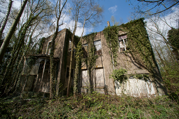
It took a long time to come up with an idea, too long. I began looking into the element 'Earth', only because I felt of all of them, earth was the most intriguing. I began researching images of where nature takes over. These images were often of places that have been abandoned by humans and then left for decades for nature to take back the land.


I thought of the idea to have a young girl playing with her dog teddy on a hill. She gets called by her mother and runs off, accidentally leaving her dog teddy behind. Then we see a time-lapse of around fifteen years where we see nature take over; grass grows up around the teddy, a tree grows in the background, older builds morph into new buildings, flowers grow etc.

I felt that my last animation was very character based and while I perhaps most enjoy working with characters and creating animations that are fundamentally character based. I really wanted to try something different and go in a completely new direction. Now this animation is told through the eyes of the element earth, rather than an actual character.

A dog teddy is featured in the animation because I new I needed a teddy to reference and a dog teddy is just what my roommate happened to possess. I took the teddy out across the road to a hill about a minute away from where I live. This hill will be the inspiration and reference for where my animation takes place.

I took many photos of the teddy from every possible angle I thought I could possibly need (always better to have too many photos than not enough) and I also took photos of the surrounding scenery that I felt could be used in my animation.


Plotting out the story and creating the storyboard happened pretty much simultaneously with beginning the process of developing my animation. The reason for this is I new the actual workload of animating this short was going to be massive. This is due to the fact that I am not just animating one thing, I'm animating everything, from individual grass grains growing to shadows moving.

Below is my storyboard...


I began by sketching the dog in the different positions and then after scanning in the sketches and placing them on photoshop, went over them with a solid line. The first bit of animation I wanted to do for experimental purposes were the grass growing around the teddy.


On a separate layer I drew around ten grass strands standing at different heights in a line. Then through using the same technique as hand drawn animation I extended the grass stands slightly on a new layer and continued this process for around nine frames. Then after the grass had almost doubled in height I went back and added extra frames in between each old frame. This way we can watch the animation for longer.


Just drawing and colouring these frames have taken a very long time to do. Around fourteen hours if we're getting into specifics. I felt that to get the right effect not only did the grass need to be coloured with a solid colour, but they also needed to be shaded with a lighter colour to add the effect of a light shinning on the object.


To save time in my animation I thought instead of drawing, colouring and shading a sky, to instead use photography. I feel this could add to the time-lapse effect if I took photos of the sky at different points in the day, e.g. every ten minutes. Or I could take photos of different parts of the sky, so when I play it back it looks like clouds are passing over incredibly quickly like in a real time-lapse video in some sort of nature documentary.

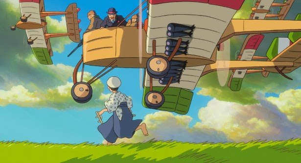
Another inspiration for me with this animation is the quote from director/animator Hayoa Miyazaki...


I am very interested in the idea that man underestimates nature and that the planet doesn't really need us at all. If we were to all suddenly disappear off the face of the planet, the planet would just carry on living and the element earth would take back the land we have spent centuries developing.

Monday 10 November 2014

Flipbook Research: Matrix style Flipbook

I'm sure many people have seen this flipbook before, because it is absolutely amazing. It covers everything and makes even the simplest form of animation look incredibly complicated and intricate. It plays around with every camera angle and we spend little if not no time looking at a character from one position. I also love how it plays around with timing.


The Matrix is an excellent example of how great action sequences have excellent timing with the famous bullet time sequence and here, in this flipbook it is used to create the same mind blowing effect. Even if the whole thing is drawn it still feels like watching a series of highly complicated visual effects.

Pose to Pose Animation Research: Itchy and Scratchy

Pose to Pose animation is basically when a character moves from one pose to the next in an animation so instead of just non-stop running a character might run, stop and run again. Basically a main animator will plot out all the keyframes; so what positions they want the character to get into and then it is the role of the other animators to fill in the gaps with other frames.


For example we can see from the above Itchy and Scratchy cartoon; Scratchy walks outside, he stops in a position (keyframe) picks up Itchy and hugs him, stop (keyframe), then Itchy proceeds to attack him.

Frame by Frame Animation Research


Above is an example of Frame By Frame animation that I found on YouTube. As might be able to make out, below the main frame we can see many frames underneath and each frame contains the horse in a slightly different position. When the animation is played back it runs as a sequence, this sequence happens to be a running cycle. 

But unlike Pose to Pose animation there are no keyframes meaning that if an animator is animating this sequence there is no filling in the gaps, the animator will just animate from beginning to end until the shot/scene changes. Although the animation is simple in that there is no back drop, it clearly demonstrates what frame by frame animation is as we can clearly tell what we're looking at.

Evaluation

Throughout this course I have learnt so much as we've covered so much content. The entire module has been about learning animation skills and the 12 principles of animation, in particular applying the 12 principles of animation to our own work. We began with storyboarding potential animations of our own. Initially I was skeptical about storyboarding because I just wanted to dive straight into creating animation, it was soon that I learnt how important the storyboarding process is. My storyboard needed to be clear and easy to understand so it could be simple to follow if I was the animator going to animate it.

When we were tasked to create to create flip-books I felt it would be the simplest thing in the world to do. I was not at all prepared for just how much skill is involved to create a flip-book that flows well. We had to factor so many aspects into account with just a simple ball bouncing up and down movement for example timing (a problem I had with my ball animation is that my ball would move at the same speed throughout the animation when it should speed up and slow down) and squash and stretch.

I feel my flip-book animation skills have improved greatly and feel these skills can be applied to every form of animation. The concept of squash and stretch I have used on every animation I have created since, obviously this concept is much harder to apply to pixilations.

I found the Pendulum animation far easier to create than my flip-books. I feel this is because the experience I had creating my flip-books gave me more confidence that I could apply to proceeding animations. When I played my pendulum back it ran much smoother than anything I had created in the past.

I feel not only my animation skills have improved throughout the module, but so has how I approach animation. I feel like now I approach animation with a lot more planning because I now realise that without an effective plan I can only get so far without either hitting a wall or it effecting how well my animation flows.

When it came to creating a pixilation I admittedly did not dedicate as much time to it as I should have done. Because it was live-action photography I felt that I did not need to plan it out as much as a drawn animation. My lack of planning was evident when I played my final pixilation back but when I created another pixilation in Apply it allowed me the opportunity to vastly approve on my skills and create something of a far higher quality due to more thought out planning.

Overall, I have found this module incredibly interesting and I have learnt so much that I can apply to my own skills. I feel that although I still have so much to learn about even the most simplest forms of animation, I now have the confidence to try new things I would before have been to skeptical to ever attempt.

Gravity Falls

Gravity Falls is a show about two siblings, a brother and a sister who go to live with their eccentric Grand-Uncle Stan in the strange town of Gravity Falls. Throughout the series the pair embark on bizarre adventures and get themselves into extreme situations, often due to poorly thought out schemes (strange how similar all these animated series sound when I describe them. I guess if you find a formula that works you stick to it.) 


I really like the show because it gives us something different. The plot lines are completely wacky and I love shows that have well thought out universes. Often my problem with cartoons is that the world around the characters is given hardly any thought, it just seems to be set in two settings, the characters house and a local bar for example. But I love how in Gravity Falls the world is so large and there are so many different places that are explored in every episode.


Sunday 9 November 2014

Attack on Titan

Apart from being incredibly depressing to the point it'll put you in a bad mood for the rest of the week. This Japanese anime series is an incredibly good watch.


I actually found a pretty lighthearted photo which is good because wow, is it depressing. Attack on Titan is about a small society of people who live in a walled city protected from Titans. Titans are giant people basically who like killing humans for apparently no reason. One day the Titans break through one of the walls and after that event three friends Eren, Mikasa and Armin must join an elite group of people dedicated to wiping out the Titans once and for all.

What I like most about the show is not the beautiful, painstaking animation or the breathtaking action sequences of which I imagine is incredibly hard to create in animation, but is actually the characters. Throughout the one series we see these characters age five years and are given more and more back-story.

Every character is significant and complicated. Its not just a case of humans-good, Titans-bad. Frequently the three protagonists are up against everyone else as well. It covers everything, its a coming-of-age story but its also about finding your place in the world. To me even though it's called Attack on Titan it isn't really about the Titans at all, they just symbolise 'the enemy'. The Titans could just as easily be war, famine or an ecological disaster. What the show is actually about to me is how humans deal with these sort of situations and how human nature can sometimes become just as bad as the big evil.

The Amazing World of Gumball


The Amazing World of Gumball is an American animated series about a blue cat called Gumball and his adopted goldfish brother Darwin. The two characters frequently get themselves into weird situations due to poorly thought out schemes. I really like the series because to me, nothing is less interesting than a central character who is cool, popular and smart. I cannot see how anyone would find this concept interesting. One of my main problems with Adventure Time, to me an otherwise great show is that the main character is too cool and popular. To me your protagonist needs to be a bit of a loser because it gives you something to root for.


The character Gumball is likable to me because he is a bit of a loser, and an idiot.


When I began watching the show, initially I didn't like the animation style. As you can see from the images, the show uses so many different styles of animation and design. There are characters that are rendered in 3D and there are simply 2D animated characters with outlines (see Gumball's family). When I began watching the show I felt this was not inventive, it just made everything look messy. A friend of mine who loved the style explained to me that it's a show for Graphic Designers. Since then I have come to appreciate and love the style, now I understand messiness is kind of the point of it.

South Park

South Park has always been one of my favourite animations, if not favourite shows. I've watched it, got bored of it, went off it, rediscovered it, loved it etc. so many times now I've lost count. It's still on the air, I don't know what season it's on now, fairly certain it isn't too far behind The Simpsons which I'm sure many will find hard to believe. I'm sure a lot of people who loved it in the early days probably don't know its still going.


To me the show has peaked, there isn't a particular series to me that comes to mind, just every so often there's a masterpiece of an episode. What I love about this show is yes it's incredibly crude with it's rigid paper cutout animation style, it's incredibly rude with endless fart gags and many consider it incredibly offensive; it seems like every week the creators think up someone knew to annoy. But it always has a point to make.


To me it's not like something like Family Guy where its rude gags, rude gags and if you look underneath it all to try to find some sort of beating heart, you're just going to find more gags. In South Park, something I've only come aware of in the past five or so years is that if you look past the crudeness and approach it with an intelligent perspective you will see that every episode has a point to make.


My favourite episode of South Park is probably Imagination Land where terrorists bomb the magical world of the kids imagination and after chaos unfolds the US government think about the possibility of nuking Imagination Land for good. Now many people who might be slightly stubborn might just see this episode as plain offensive because Trey Parker and Matt Stone (the show's creators) are having terrorists blow up stuff in a cartoon. But I hope most intelligent people will understand the point of that episode, to me anyway is that terrorism has become such a massive thing in the public eye that so much hysteria has been created it's almost successfully invaded our imaginations.

The Life and Times of Tim


The Life and Times of Tim is an adult animated HBO series that revolves around Tim, a normal guy who frequently gets into bizarre situations. With only three series,the show has been off the air since 2012 but to me it remains memorable due to its humor and style. The animation is incredibly basic. The characters rarely move at all apart from their mouths, I can't remember actually ever seeing any of them walk.


But even though the characters look rigid and paper-thin, I never found it boring to watch. I liked the style because to me it fit the tone and added to the comedy. In fact I don't think it would have been anything like as funny if the style was more 3D for example. It's like to me if something like South Park was drawn in a much more dynamic and complicated way it wouldn't work to me because the reason both these shows work is because they can get away with such crudeness because they are so crude.

Adventure Time


Adventure Time is an American animated series about Finn the human boy and his best friend Jake the dog. Jake can talk and has the power to stretch himself like an elastic band, Finn is just a kid and has no powers.As you can probably imagine from looking at the above image, the show is completely bonkers, makes zero sense but is insanely fun.

The animation is also gobsmackingly beautiful so you can watch it, and even if you've completely lost track of the plot you can still enjoy it for its incredible colour pallet and amazing scenery. It isn't all wacky weirdness though, at the center of the show is the strong beating heart of these two central characters. One of my favourite things about television series that sets apart from the movies slightly is character development. One of my main complaints about cartoons, even my favourite of all time The Simpsons, is that there is not enough character development. In Adventure Time we're almost watching this kid grow up in this surreal world and the writers have aged him.

Obviously I'd like more character development, things pretty much go back to normal after every episode but at least over the years there has been character development to some degree.

Saturday 8 November 2014

Bee and Puppycat


Bee and Puppycat is a bizarre animation I was shown on YouTube. It is a cartoon developed by the Cartoon Hangover web channel and the show was created by Natasha Allegri. I've only seen one episode so far but from what I have seen, I have really enjoyed. The story is incredibly bizarre and the characters are very likeable, especially the main character Bee. Although she lives in a slightly surreal setting the show succeeds in making her realistic and relatable.

http://www.youtube.com/watch?v=lOG_UtLxh58

I also really like the style of the show and it reminds me of a similar show of which fans of Bee and Puppycat I'd assume would be more than aware of, Adventure Time, created by Pendleton Ward. It just so happens that Ward and Allegri are friends and Allegri also works on Adventure Time so to me it is fairly easy to see where some of the inspiration comes from.

Gorillaz Do Ya Thing


Jamie Hewlett's work is going to appear on this blog a lot, sorry but he is one of my favourite artists. And to me it doesn't get better than his work on the band Gorillaz. Here I'm going to talk about the most recent music video he directed for the band before they went on a massive, unbearably long hiatus. I've loved this band for around ten years now and in that time its been amazing to watch something like this evolve and grow. The characters have changed. Rare in animations the characters have aged with the time as have their creators.


(Gorillaz band member Noodle age ten to 20)

Not only have the characters changed in their looks to keep things fresh and interesting but so has the animation style. We're now at the point, around Phase 3 where the characters are rendered in 3D CGI. At first I didn't like the style. I was annoyed because I felt that everything was turning 3D and traditional animation was dying out so it was nice that in 2010 a massively successful band like Gorillaz still animated in good old 2D. To me it felt like trying to appease fans instead of doing their own thing.


Eventually I grew to like the style and feel that it particularly works in this video set in the band's new house. To me what I feel the charm is of Gorillaz and why to this day they are so popluar is not just the music, but how these characters co-exist in their own slightly surreal universe in the music industry. They are slightly separate but kind of always want to be accepted.


To me now that these band members look more life-like they fit in a tiny bit more with the real world but still keep their insane cartoony-ness. E.G. 2D does have a more solid look and his movements are less rigid, it actually feels like if you touched him it would be more like touching a person than a piece of paper. But don't get me wrong, his eyes are still massive black circles.