Wednesday 22 March 2017

Extended Practice: Weekly Blogpost - Animation Production

For my third shot that involves animation, it was the first time both characters of Cop and Lucy appear onscreen together.

I knew the shot was going to be complicated. The reason for this is not only because both characters are onscreen together, but they also are walking towards the camera, meaning they grow in size. Enlarging one character without distorting their proportions is complicated enough but doing it with two different characters who grow at the same time and also need to stay in proportion to each other is even more complicated. Luckily I'm working with Animate that allows me to move frames about and resize frames effortlessly so at this point I did not worry too much about it.

Gaining Reference Material


I knew this was a shot that was too complicated for me not use reference material for. Initially in the Live Action Video I had used Malachi and Sylvia as my actors. Unfortunately I had not staged the camera right and they were not quite the right physicality's for me to reference, Sylvia was a tad too tall to pull off a ten year old. Annabeth had also given me feedback to be careful when referencing adults acting out the parts of children, it could quite easily look uncanny and my animated character could just resemble an adult acting like a child. I was cautious of this so decided to find someone who has a physicality that most resembles a ten year old.


Luckily, I found Brenda who turned out to be the perfect actor. Her movements were so exaggerated and she walked in a way that was so bizarre that a ten year old just definitely would walk like if asked to carry something heavy. I did not tell her to walk like this but she definitely inspired the animation of the character. 

Furthermore, Gavin also turned out to be an excellent actor. His physicality in this shot is slow and rigged which is the opposite of Lucy's and just like the character.

Animating the shot

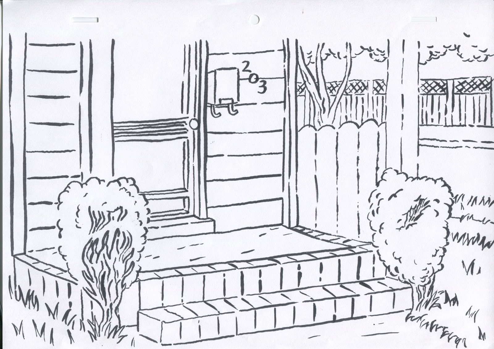
Essentially I went about animating the shot the same way I had for the other two by animating roughs, then the neats on Animate CC. But this was also the first shot in which the characters interact with their environments, in that the Cop opens the front door of their house. Since the rest of the background designs had been coloured with felt tip, I knew it would look out of place if the door was painted digitally. Therefore I printed each doorframe line work keyframe still onto paper then coloured each keyframe of the door before placing each hand coloured frame back into the animation. While this was slightly time-consuming process, I feel that in the end it really added to the visual aesthetic of the animation.

Sunday 5 March 2017

Extended Practice: Testing Backgrounds Continued - Lucy Aged 17

The Lucy aged 17 section of the animation will be the hardest backgrounds to produce I am already predicting. They need to look the highest quality as she is at her oldest and they also need to reflect her mood which at this point is quite complicated and hard to visualise. I wanted to avoid the obvious 'she's a troubled teen so the colours are dark and there's a lot of sharp lines and edges to reflect her damaged psyche'. Instead I wanted to portray her state of mind as a tad absent, a bit all over the place, slightly chaotic with a hint of rebellion. 


I had a brief look at abstract art on the internet and felt like if I was going to produce anything like what I was finding, the change in aesthetic would be too jarring. For my next idea of visual aesthetic, the inspiration came from the Disney film 101 Dalmatians and the background art of Walt Peregoy. 

I re-watched the film recently but have always loved the visual style of the film, especially the background art. His style is very loose with the colour, the colour rarely stays within the lines but it doesn't matter because it's what gives it it's charm of being slightly messy and fun. This is essentially what I want to go for with my backgrounds. 


I knew I wanted the background to look 'loose' but I felt like if I went straight in without obeying any laws of proportions or taking into account things like vantage points then the backgrounds could end up just looking bad. Even with the backgrounds in 101 Dalmatians, Walt Peregoy makes sure everything fits together; in a room wardrobes and other pieces of furniture are placed in a way that is organised and makes sense so the characters can interact with it.


I begun by printing the maya screen-grab and tracing the printed image on layout paper. Then, using the photo reference of the nan's house that I found on Google Maps added the details. From looking at the below image it is evident to me that creating a Maya model version of the nan's house was a very successful idea and served to do exactly what I intended. That was to provide me with a guide of how to quickly create realistic buildings that have correct proportions and dimensions without having to figure it out by hand. I was able to create the line-work for this background far quicker, than had I not used my Maya guide.


The line work of these backgrounds will take some figuring out. When she was 10 the line-work was thick and wobbly, then when she was 13 the line-work had progressed to be straighter, neater and thinner to represent maturity. Now I knew I didn't want to go the route of simply making the lie-work thinner and neater because I felt this would be dull and would be doing a disservice to visually representing her current state of mind. For the first technique, I used a brush pen. I really liked the effect this had of being quite rough with it's strokes and not entirely filling all the gaps (representing her slightly absent mind). My fear here is that these lines maybe too thick, they will definitely be thicker than the character's so could distract attention away.


Above show both my tests with line-work, the first with 4B pencil and the second with Brush pen. After receiving feedback, I was told that the brush pen line test was the most successful. So that is the one I decided to go with.


I had made the mistake of drawing my line-work onto cartridge paper of which does not absorb watercolour well. Therefore, I had to place my line-work on a Lightbox underneath a sheet of watercolour paper and paint the watercolours on top. I had had a little experience with using watercolour so my skills were still at novice level. Wing had given me advice that I should paint the sections I want to paint with watercolour with just water first. This technique really helped me to control my painting and increased the quality of my work overall. 

Oscar had advised me that I should perhaps try using the watercolour brushes on Photoshop. The brushes he showed me looked incredibly authentic and just like real water colours. He advised me that working in this technique may speed up the rate of which I can create backgrounds as it'll save on time I spend waiting for paint to dry before adding second coats and will allow me room to make however many mistakes I want with the undo button.


I spent around four hours creating the above background and the feedback I received for it was very positive, even on Oscar who had talked up digital watercolour painting to me. Even though this process was time consuming and perhaps could be a lot more time consuming than digital, I will be creating all my Lucy aged 17 backgrounds with watercolour on watercolour paper. Furthermore, I feel this makes my animation and the visual aesthetic of my animation more consistent and true to itself. I had created all the other backgrounds by hand so I felt it was a bit of a cop out to then just make the third set of backgrounds digitally.

Saturday 4 March 2017

Extended Practice: Testing my New Backgrounds

Developing the Backgrounds of Lucy Aged 10


Drawing like a ten year old was easier said than done. I really did not want the art to look like it was the work of someone immitating a ten year old style. The way I went about creating the backgrounds was by trying to remember how I drew when I was ten (so a lot of bright colours and thick lines) and then I looked for inspiration on the internet.


I found a page on Wordpress that displayed only drawings by ten year olds. As you can see there is a large variety but most, to me anyway, look like they were drawn by ten year olds. Having that as reference when drawing my own backgrounds was very beneficial.

I was worried that my background with it's bright colours would detract attention away from the character. But luckily when I scanned the backgrounds into the computer I needed to do no colour editing whatsoever. I feel the look is very successful. While this visual aesthetic worked and to me anyway did not look too jarring, it would only work as a background if the other two visual aesthetics of backgrounds worked. So before I could move on, I needed to create examples of the other two visual aesthetics.

Developing the Backgrounds of Lucy Aged 13

For when the animation transitions to when Lucy's 13, I wanted the backgrounds to look very neat and ordered, to represent someone who is growing up but hasn't reached that stage of teenage rebellion, furthermore has nothing to rebel against. She still respects her father immensely and enjoys following the rules (reflecting how she respects order e.g. her father the cop). Therefore I went about designing the background by being a lot neater than I had previous, taking full advantage of the vantage point technique I had learned from The Simpsons art book.


Whereas when she is 10, her line-work is a lot less thick her and doesn't vary in size.


Finally I wanted the colours to reflect her. She is not as playful as when she is ten so the colours are not as bright, yet she is still a happy child so none of the colours are dark in any way, they are still of light tones.


Again, it was all well and good that I had created another background that I felt was visually successful on it's own, but it couldn't just work on it's own, it needed to work with the characters on screen. Again I drew Lucy in a still shot looking exactly how she will look in the final animation and placed her exactly how she would appear in the final animation. I feel that the results are very successful. She was always going to look less jarring in front of this background than when she is 10 because the backgrounds are toned down and less bright and in-your-face. 

It is quite a change in aesthetic from the first and that is slightly concerning to me as I want to be sure that it wont be too jarring when the scene changes to the new aesthetic. Of course the viewer will notice and I am okay with that, in fact I feel I almost want them to notice than not. Although Annabeth did warn me that this transition could be too jarring and might not be a good fit for an animation that is only 2 minutes long, it could be that because the scene changes are so quick the viewer will not be given enough time to adjust to the different aesthetics. I feel that once I've created the third and final background aesthetic I will know better whether the changes will work.

Developing Background Designs and a New Direction

From the start of this project I had wanted the backgrounds of my animation to be created entirely by hand with watercolour. I knew what that could look like and if it looked like what I in my head had envisioned then I knew the animation would look good. However, from the start of this project, I also knew that I was indeed no expert with the art of watercolour, so I was essentially going to need to learn it and not only that, learn it to the extent where I can make backgrounds that look very successful, not like they were made by someone at ammeter level. Therefore I knew it was a wise choice to get Lauren involved with developing watercolour backgrounds. I saw the watercolour backgrounds she was creating for her work and they really blew me away, especially because of how well they could look with her digitally drawn characters. So we were on the same wavelength on how we wanted our animations to look, I asked her and she was happy to develop my backgrounds for me.

Although, this did not entirely solve my problem. There are 80 shots in my animation, and I know that there wont be 80 different backgrounds that need to be created but even if it's half that amount that is still too much that I can expect anyone to create for any animation that isn't their own.

I had a knew idea at a random point that I could solve this problem with a new idea...

The New Idea

The story of my animation is told from the protagonist (Lucy's) point of view and the story is split into three segments; the first when she is ten, the second when she is thirteen and the third when she is seventeen. I felt that the backgrounds could reflect whatever age she is by looking like they were drawn and coloured by her at that age. So when she is ten I felt the backgrounds could be drawn with thick slightly wobbly lines and coloured with bright felt tip, then when she is thirteen, her surroundings look a lot neater and everything is coloured within the lines with coloured pencil, finally when she is seventeen, that is when I can introduce watercolour when she has matured enough as an artist or simply someone who likes to do it in their spare time.

Feedback on the New Idea

I received positive feedback about this idea from my peers and Annabeth. Although she did give me advice that the background designs should also reflect the character's mental state, since there is no dialogue in my animation I do need to rely on visual story telling. Therefore, when she is ten the colours need to be bright and colourful to show her carefree immaturity and the colouring slightly outside of the lines represents her sense of playfulness and fun. Then when she is 13, she is a very neat well behaved school kid who respects authority and is less fun than when she is 10 and more into her studies, this is represented with lots of straight boring lines in the background designs and light coloured pencils that stay within the lines. Finally when she's 17 I want her lines to look a lot more rebellious and abstract/experimental, I know this is the stage I really want to incorporate watercolour into but at this stage I am not sure how expressive I want the line-work to be.

Annabeth also mentioned to me that while she liked the idea, the changes in visual aesthetic could be jarring to the viewer. She encouraged me to when Lucy in the first scene is waiting for her dad to pick her up and is doodling, have her drawing her dad, then in a perspective shot we can see the drawing that has been created with colouring pens and the title of the animation 'Cops and Daughters'. Furthermore, she said that it would not be wise to leap straight into this and start creating all my backgrounds following this idea immediately, I needed to test it. I needed to create three examples of screenshots from the animation with each of the three different visual aesthetics to gain a solid understanding of whether this idea was going to work. 

Animating with Adobe Animate CC


I decided that drawing straight onto Animate, of which was my original intention, was going to be too difficult. I decided to go about the animating process by drawing out the roughs my frames by hand on layout paper, and then going over these roughs to create the neat frames on Photoshop. Now, I had been given feedback about working with this method that it might be too time consuming. I have been known in the past to create roughs that are very neat in that I like to perfect them which when I'm working with each individual frame is incredibly time consuming. If I was going to create my roughs by hand and individually scan them, I had to justify my time management by making my roughs as rough as possible. 

They had to serve as a basic template, the neats are where I should put most of my time into. 


I feel like the roughs I've developed for my very first shot in which Lucy (aged 10) is sat bored at her school desk waiting for her dad to pick her up, were pretty basic and I tried hard not to spend too much time on each frame. Drawing the human form and keeping a basic consistency with proportions is a skill of mine within animation so I was able to create these frames very quickly. This skill does get lost a bit when I transfer it over to the computer as I feel less free with a Wacom pen and tablet.


Once I had put all the rough frames into position on Animate I began going over them to create the neats. At first I was a little wobbly as the Smoothing tool takes time to get used to but pretty soon I got the hang of it. After a certain amount of frames drawn I began to really like the line-work I was creating, in fact as a personal preference I liked the line work I was creating in Animate more than the line work I have created in the past when drawing neat frames on Photoshop. 

The Smoothing tool was one I was quite skeptical of, I really did not like the idea of any piece of software 'correcting' my line-work because to me that felt like cheating and that the work I was creating was not entirely created by me. But after trying it out and playing around with the intensities of the setting, I actually found it to be very beneficial to me. Often when drawing on a computer I waste a large amount of time with having to redraw the same line because the line I created is wobbly and does not look right, that is where the smoothing tool came in very handy.

Colouring

Colouring was something I was again skeptical of. At first, colouring on Animate I found to be very tricky and missed the technique that you have on Photoshop of colouring on a multiply layer separate from my line-work layer. I was having trouble and was becoming frustrated. To the point I wanted to abandon the software altogether, furthermore Jazza who had previously solved all my problems with the software with his tutorial did not seem to help and I found that section in the video that talked about colouring confusing. Eventually I found that the problem I was having was an easy fix and once I got the hang of it found that colouring was a far quicker process on Animate than on Photoshop, this will be very beneficial to me with my practice further into the animating process.