The Lucy aged 17 section of the animation will be the hardest backgrounds to produce I am already predicting. They need to look the highest quality as she is at her oldest and they also need to reflect her mood which at this point is quite complicated and hard to visualise. I wanted to avoid the obvious 'she's a troubled teen so the colours are dark and there's a lot of sharp lines and edges to reflect her damaged psyche'. Instead I wanted to portray her state of mind as a tad absent, a bit all over the place, slightly chaotic with a hint of rebellion.


I had a brief look at abstract art on the internet and felt like if I was going to produce anything like what I was finding, the change in aesthetic would be too jarring. For my next idea of visual aesthetic, the inspiration came from the Disney film 101 Dalmatians and the background art of Walt Peregoy.
I re-watched the film recently but have always loved the visual style of the film, especially the background art. His style is very loose with the colour, the colour rarely stays within the lines but it doesn't matter because it's what gives it it's charm of being slightly messy and fun. This is essentially what I want to go for with my backgrounds.


I knew I wanted the background to look 'loose' but I felt like if I went straight in without obeying any laws of proportions or taking into account things like vantage points then the backgrounds could end up just looking bad. Even with the backgrounds in 101 Dalmatians, Walt Peregoy makes sure everything fits together; in a room wardrobes and other pieces of furniture are placed in a way that is organised and makes sense so the characters can interact with it.

I begun by printing the maya screen-grab and tracing the printed image on layout paper. Then, using the photo reference of the nan's house that I found on Google Maps added the details. From looking at the below image it is evident to me that creating a Maya model version of the nan's house was a very successful idea and served to do exactly what I intended. That was to provide me with a guide of how to quickly create realistic buildings that have correct proportions and dimensions without having to figure it out by hand. I was able to create the line-work for this background far quicker, than had I not used my Maya guide.


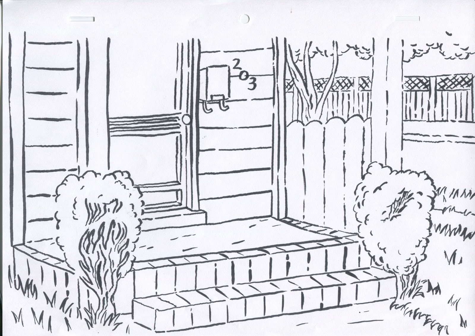
Above show both my tests with line-work, the first with 4B pencil and the second with Brush pen. After receiving feedback, I was told that the brush pen line test was the most successful. So that is the one I decided to go with.


I had made the mistake of drawing my line-work onto cartridge paper of which does not absorb watercolour well. Therefore, I had to place my line-work on a Lightbox underneath a sheet of watercolour paper and paint the watercolours on top. I had had a little experience with using watercolour so my skills were still at novice level. Wing had given me advice that I should paint the sections I want to paint with watercolour with just water first. This technique really helped me to control my painting and increased the quality of my work overall.
Oscar had advised me that I should perhaps try using the watercolour brushes on Photoshop. The brushes he showed me looked incredibly authentic and just like real water colours. He advised me that working in this technique may speed up the rate of which I can create backgrounds as it'll save on time I spend waiting for paint to dry before adding second coats and will allow me room to make however many mistakes I want with the undo button.

I spent around four hours creating the above background and the feedback I received for it was very positive, even on Oscar who had talked up digital watercolour painting to me. Even though this process was time consuming and perhaps could be a lot more time consuming than digital, I will be creating all my Lucy aged 17 backgrounds with watercolour on watercolour paper. Furthermore, I feel this makes my animation and the visual aesthetic of my animation more consistent and true to itself. I had created all the other backgrounds by hand so I felt it was a bit of a cop out to then just make the third set of backgrounds digitally.
No comments:
Post a Comment