Thursday 26 February 2015

Visual Language: Take 5 Do I Wanna Know?

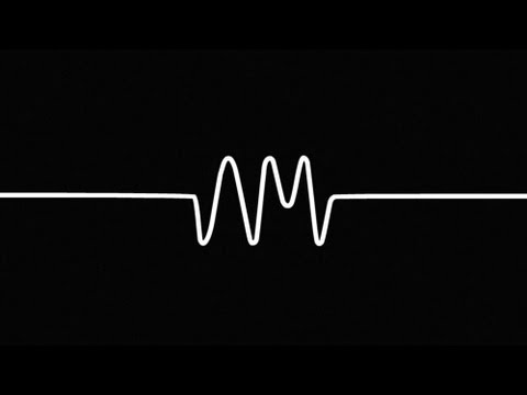
As part of the brief I researched other sound animations. For example the first animation I researched was the music video for the song Do I Wanna Know? By the Arctic Monkeys.


I really like the video because it is an incredibly simple idea and looks pretty basic yet is also very effective in its simplicity. As the video goes on, the visuals get gradually more complicated and more things begin to happen on screen. The video is also completely in time to the audio with visual sound waves. There is also a different sound wave for certain sounds made e.g. when the lead singer Alex Turner sings the white wave is animated but then when the backing singers sing two blue waves appear either side.

Visual Language: Environmental Storytelling Up

I've always loved the film Up, but what ever you think about the film, it is visually stunning. What Up achieves is making landscapes that are incredibly realistic to the point where at first glance, one could mistake these landscapes for the real world, but also keep characters that look cartoon-like but not stick out in this world. The world all Pixar films create is familiar with us viewers, but we also watch films like Up and can suspend reality.


The movie takes place in two different parts of the world; the city of which the protagonist has lived in his whole life that is very much made up of human infrastructure such as buildings, cars and roads. And Paradise Falls which is entirely the opposite, an environment that looks untouched by humans and completely natural.

Visual Language: Environmental Storytelling The Lego Movie

The Lego Movie is a 3D CGI film. The visual style of this film is basically like your watching real Lego animated so it has often been miss understood with the popular misconception that the film is actually stop motion with real Lego bricks when in actuality it was entirely created on computers.


What I love about this film's visual style is that you can't tell that it is CGI. All the sets are beautiful and ridiculously complicated, the landscapes look like they could never be completely achievable to be built by real people. But developing the movie in CGI was obviously more efficient due to the sheer volume of Lego bricks that would have had to used in order to create some of these massive landscapes.

Furthermore the environments in the Lego movie are vast and beautiful, but there are also many different landscapes in the movie and are all diverse and entirely different from Cloud Cuckoo where everything is bright, colourful and mad to the Lego wild west where everything is wide open and looks reminiscent of our world. The Lego movie succeeds in pulling us into it's vast universe and we start to believe these world's exist.

Visual Language: Environmental Storytelling Princess Mononoke

As part of the Visual Language Environmental Storytelling brief we were required to research other animations that are examples of Environmental Storytelling. An animation I looked at was the Studio Ghibli film Princess Mononoke, directed by Hayoa Miyazaki.


I absolutely love this film for its visual style, in particular the beautiful landscapes presented in the film. It is almost entirely set outside in an untouched forest. When humans come into the picture they threaten to disturb the forest's delicate ecosystem for the good of industrialization. When the humans begin their activities the natural land reacts negatively.


Although some elements of the film were CGI the backgrounds were entirely hand drawn and painted. I feel this technique allows the film to be stylistically beautiful but also have a nice traditional feel to it.

So much of the film is visual, there is actually very little dialogue. So much of the film is spent watching movement and landscapes. Many of the creatures in this film such as the forest spirit do not speak so instead the story is told through watch we are watching on screen. We know that humans are damaging this delicate environment, not because we are being told, but because we are watching the land and the forest change colours and begin to rot.

Wednesday 25 February 2015

Visual Language: You Spin Me Right Round

Because I felt my original 12 image turnaround did not meet the desired standards I decided to go back and start over with a new far less complicated image that I would dedicate more time to being more precise with.

The new object was a Moshi Monster toy measuring around an inch in height. I felt this new object would be far easier to draw accurately multiple times because unlike the original light show object that was bade up of complicated shapes such as hexagons and circles, this new object had a sort of basic round shape.

I wanted the object's proportions to remain consistent on every image so to do this I drew it's basic shape, a sort of circle with a pencil on one page and decided that if this was a real creature, this circle would be it's skeleton so the drawings I draw over the top of this circle can never out-grow or shrink inside the circle. Therefore, this circle acts as a basic guide for me to keep the size of my object consistent throughout.

Furthermore, I also changed my process of producing this twelve image turnaround by not drawing a new image from scratch every time. What I mean by this is that I always kept the previous frame beneath the frame I was working on at the time so I could make sure the proportions were right by matching them up with previous drawings.

Once I had finished my frames, scanned them in and produced an animation, I was very happy with the results. I felt the animation ran smoothly and the proportions were consistent throughout, far more than my previous attempt.


I couloured my animation which I felt really improved the animation and brought it to life. Moreover I learnt that devoting more time and being more precise with something like this where rushed work is obvious pays off immensely.


Below is my final Moshi Monster Turnaround...


Visual Language: You Spin Me Right Round

We were assigned a new brief to draw twelve images of an object gradually turning 360 degrees. Then we would create an animation by putting the twelve images into a twelve frame per second animation. How I kept a consistency between images was by placing my object (a light show machine that belongs to one of my flatmates) on my coffee table. Then I placed twelve coins on the table around the object in a clock formation. Then I would draw the object facing one of the coins and turn it to face another coin going around the table clockwise.

After completing all my images I tried to put them together as much as I could on Photoshop but when I played the images back on Premiere but I have to say I wasn't very happy with the result. to me the images felt entirely inconsistent and the proportions of the object seemed to change throughout. Furthermore the light show object did not fit entirely on the page. The top of the object would extent over the top of the sheet.

Examples from my object turn around...


I would now like to go back and re-draw another twelve image object turnaround, but this time I feel it would be beneficial for me to start over with an entirely new object, one that is not nearly as complicated.

Monday 23 February 2015

New Brief: Campaign

We have been given a new brief. In this new brief we had the option of choosing from three different projects. It was a difficult decision to make but in the end I decided to go with the 'campaign' option. The reason for this was because even though I felt and still do feel it would be the most challenging option and probably least fun option to go with, if done correctly it could end up being a very important piece of work. Another reason for me choosing this particular option was because in the past I have often known people who when they think of animation, think of just cartoons for children and I feel that often people don't believe they could be anything more or serve a greater purpose.

I feel if it is handled correctly and is particularly empathetic to the subject matter that the end result could be very successful. After the last project being slightly over ambitious and a bit of a gamble due to how challenging it was. I am a little bit skeptical about picking the option I feel would be the most difficult, but I feel I would also be the most passionate about it and really want to treat the subject matter with respect.

To take on a task like this there are many things I need to take into account. Firstly, the tone. Initially I felt that to create an animation for a charity like Childline that the animation has to be completely serious and completely sad and depressing. But I was given feedback that just because I was creating an advert for a charity, it did not need to be bleak, in fact it could do exactly the opposite and fill people with hope. For example instead of saying 'look at these neglected kids, feel guilty' the animation could make the point 'these kids have been neglected, but here's what YOU can do to help and this is what people like YOU have already done to help...'

The tone of the animation is perhaps one of the most important factors. Obviously it can't be silly. But I have been advised to try to have fun in being creative with the whole thing. I am also very interested in storytelling, which is perhaps the most pivotal part of animation anyway.

After receiving feedback about the initial first stages of the project, I now realise it is pivotal that I research in-depth both charities Amnesty and Childline.

Wednesday 11 February 2015

Visual Language: Take 5 Part Three

Perhaps the animation I felt was the most successful was my animation for the sound 031. I was very intrigued by this sound and to me it brought me back to a weekend I spent in Manchester. My friend had a basement in his house and a green strobe light. The light was silent but I feel if it did have a sound, sound 031 would be the noise it would make.

Initially I was working with a pink highlighter on layout paper.


At this point in time I new I wanted to invert all of my frames to create that strobe light effect, but I had no idea that the light would turn the exact green colour the actual strobe light was in my friend's house.


(Above) Strobe light from my friend's house


The strobe light object in my animation

Admittedly whenever I'm creating these animations there is always to me a sense of gambling. I can plan how long my animation in frames is going to be and compare that to the sound file but at the end of the day there is no way to be absolutely sure if the animation will match up with the sound. In this case though I feel I was lucky that it matches up pretty well with the sound whereas in my other animations, to me, the sound and the animation do not flow as well.

Tuesday 10 February 2015

Visual Language: Take 5 Part 2

Proceeding the first wave animation I made (012). Developing the rest of the animations took on a kind of snowball effect. The next animation I created was for the sound 013 which to me sounded extra terrestrial. I had created a stencil of the actor Steve Buscemi (see below) and I wanted to incorporate it into the animation but since we weren't allowed to include faces or obvious features, I had an obstacle to overcome.


So to solve this image problem I simply distorted the image by cutting it up into four quarters and scrambling the image. See the result below...


I rather like the new image and feel it is successful in looking abstract. I also feel the new image looks slightly alien-like so suits the extra terrestrial theme I was going for.

Below is my final sound animation...

Visual Language: Take 5

We were given a new brief as part of Visual Language. The brief was to listen to around fifty different sounds and then to draw different experiments for each to eventually develop these drawings into a set of five animations that last less than five seconds, contain no obvious features such as faces so be abstract and no writing.

At the start I had no idea how to approach the project. It was very wide in what we could do, meaning there are no wrong answers to how we represent and animate sound. The idea of being able to do pretty much whatever we want was quite massive and I didn't know where to start.

Since coming up with a drawing out of nowhere is a massive challenge I used inspiration from life beginning with a dream I had. Sound 012 reminded me of the sound of a massive wave. This led me onto remembering a dream I had some time ago. In the dream it was basically a massive deep blue coloured tsunami that just grew and grew thousands of meters into the sky. I remembered this dream because of how intimidating and real this wave felt, plus everything in the dream was blue. When I listened to the sound I was brought back to this dream.

I drew the wave from this dream and then animated it with fine line pen on layout paper. After scanning the pages and opening on Photoshop, I inverted the pages with the channel blue so it would come out that the background would be black with white outline.

Before


 After


I liked the effect this had on the animation and when playing it back, I feel it really added something to the final thing.

Below are the initial drawings I sketched upon first hearing of the sounds...


Below is my final sound animation...


Visual Language: Take 5 Feedback

I have to say, I did not get on with this project at the start. I believe for some of us, it was the ideal project. I feel like my imagination does not work in quite the way it needed to to approach this project. Some people I believe were very suited to it because it allowed them to be free to be completely creative and imaginative and create amazing things. I more like working with characters and stories so approaching this project where it all has to be abstract was a challenge.

But upon reflection, I found that actually I got on with this project a lot better than I thought. Initially I was not confident about presenting my work. But after receiving positive feedback I became a lot prouder of some of the animations I created. In particular the fourth animation I created for sound 031 received very positive feedback. It was my personal favourite too and it seems fitting that it also took the longest to create, in total around six hours. Olly responded that it was nearly perfect and generally really liked it and from looking at my feedback post it notes, the general consensus is that it was the favourite.

One of the criticisms I received was regarding my second animation, 013. The problem the viewers had with it was that they did not understand the face in the background or why it was spit-screen.

After receiving all my feedback I am a lot happier with my final animations and have learnt new skills such as not approaching briefs too literally. At the end of the day there are no right or wrong answers but the way in which I approached each sound I believe it was a lot more successful in some of my animations than in others.

Thursday 5 February 2015

Visual Language: Environmental Storytelling

For this brief we were assigned the task of visiting three places to observe and sketch five drawings from each. Two of these places had to be places we've never been before and the other could be a familiar environment. One of the unfamiliar places was a sandwich shop/ tea room. I had never been before but now admittedly it has become a regular place for me to go for lunch. I initially wanted to do observational sketches inside the shop, but due to its very busy environment around 12 pm I decided to take photos to work from instead.


Then using the photos I took, here are my sketches. In this project I most enjoyed drawing people. To be honest, I'm often not very interested in drawing environments maybe because I feel it's a weakness of mine. But I did find it fascinating drawing strangers because in my head I could come up with back stories about their lives.


The next unfamiliar place I went to was Starbucks. As with the cafe I found that these 'unfamiliar' places were not the most original I could have found. And yet I found that what is special about these places such as cafes and tea rooms is that they are places we have all been in our lifetime. No matter what our background is, who we are as people or where we've come from, almost everyone on the planet has been in some sort of cafe in some sort of shape or form. What fascinates me about these could-be-viewed-as-mundane places is that they are accessible to everyone. You will meet every sort of person in one of these establishments. They remind me of the idea of purgatory, that when we die we all come to one of these places like a coffee shop or an airport, to me I can't really imagine purgatory being in somewhere to interesting such as the Olympic stadium for example. 

These are my sketches of Starbucks...


Starbucks (exterior)


View from Starbucks window


Molly and Olly (unfortunately due to how hard I press down on my pencil the markings of the drawing I was doing on the next page came through the paper)


Observational sketches of various strangers who came into the store.


Finally the third set of sketches were the familiar place, of which I chose my kitchen. Although this initially started out dull, I liked the rather more infinite amount of time I had to work on the drawings. Because I was doing them when I was alone in my own place I felt I had the freedom to spend how ever much time I wanted on them. Whereas when I was drawing in a public space I was more self conscious and often wanted to get the drawings done as fast as possible. At the start I was just drawing objects I could see but then my flatmate Laura came in the room, and later Jasper which meant I could do observational drawings of people to make it more interesting.