Developing the Backgrounds of Lucy Aged 10


Drawing like a ten year old was easier said than done. I really did not want the art to look like it was the work of someone immitating a ten year old style. The way I went about creating the backgrounds was by trying to remember how I drew when I was ten (so a lot of bright colours and thick lines) and then I looked for inspiration on the internet.


I found a page on Wordpress that displayed only drawings by ten year olds. As you can see there is a large variety but most, to me anyway, look like they were drawn by ten year olds. Having that as reference when drawing my own backgrounds was very beneficial.
I was worried that my background with it's bright colours would detract attention away from the character. But luckily when I scanned the backgrounds into the computer I needed to do no colour editing whatsoever. I feel the look is very successful. While this visual aesthetic worked and to me anyway did not look too jarring, it would only work as a background if the other two visual aesthetics of backgrounds worked. So before I could move on, I needed to create examples of the other two visual aesthetics.
Developing the Backgrounds of Lucy Aged 13
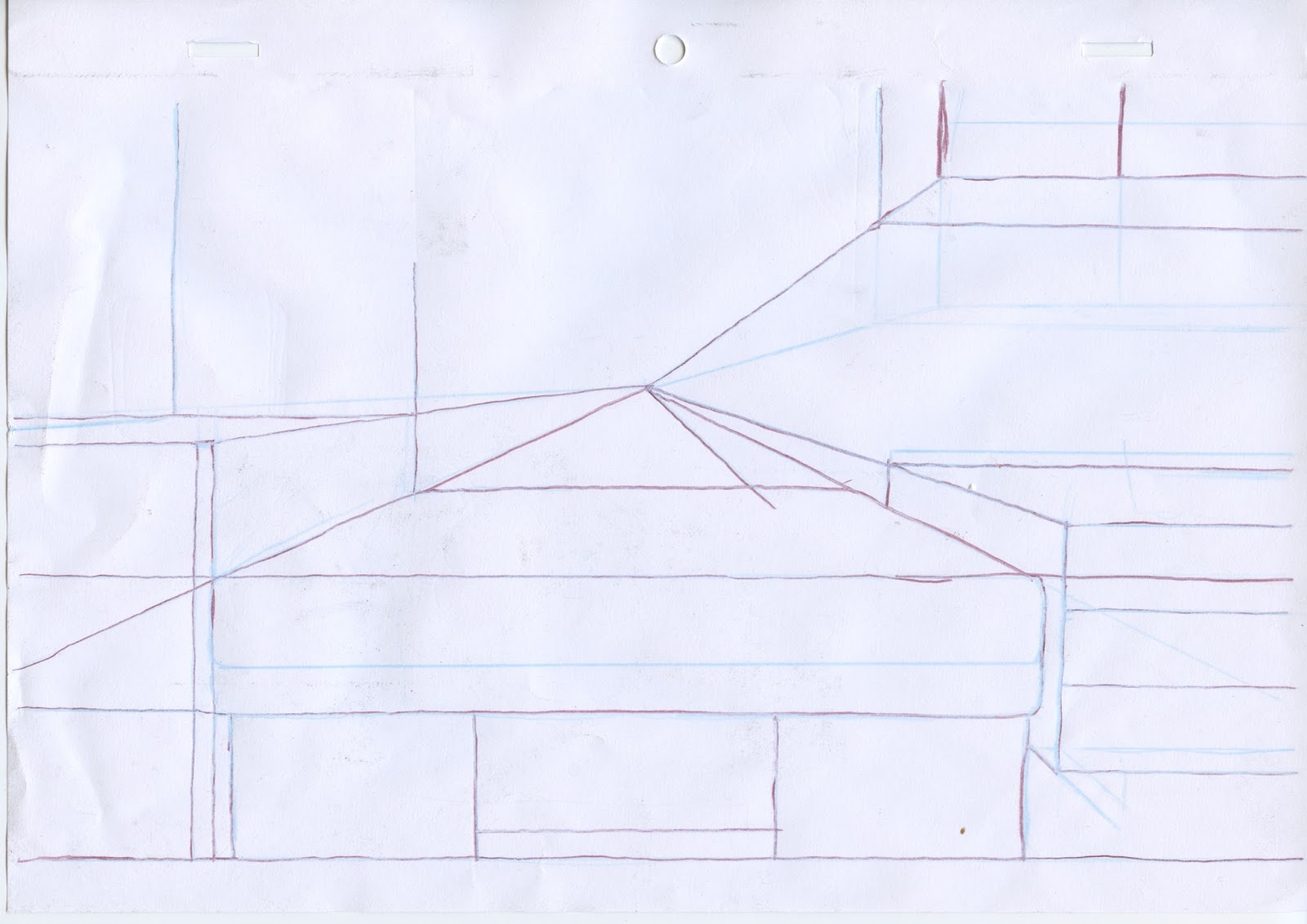
For when the animation transitions to when Lucy's 13, I wanted the backgrounds to look very neat and ordered, to represent someone who is growing up but hasn't reached that stage of teenage rebellion, furthermore has nothing to rebel against. She still respects her father immensely and enjoys following the rules (reflecting how she respects order e.g. her father the cop). Therefore I went about designing the background by being a lot neater than I had previous, taking full advantage of the vantage point technique I had learned from The Simpsons art book.


Whereas when she is 10, her line-work is a lot less thick her and doesn't vary in size.
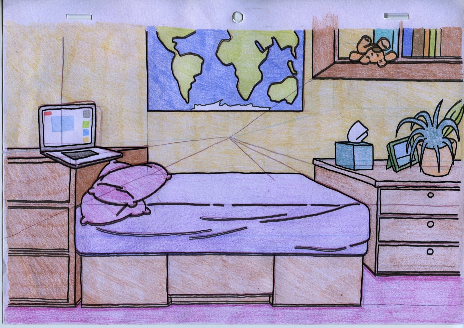
Finally I wanted the colours to reflect her. She is not as playful as when she is ten so the colours are not as bright, yet she is still a happy child so none of the colours are dark in any way, they are still of light tones.


Again, it was all well and good that I had created another background that I felt was visually successful on it's own, but it couldn't just work on it's own, it needed to work with the characters on screen. Again I drew Lucy in a still shot looking exactly how she will look in the final animation and placed her exactly how she would appear in the final animation. I feel that the results are very successful. She was always going to look less jarring in front of this background than when she is 10 because the backgrounds are toned down and less bright and in-your-face.
It is quite a change in aesthetic from the first and that is slightly concerning to me as I want to be sure that it wont be too jarring when the scene changes to the new aesthetic. Of course the viewer will notice and I am okay with that, in fact I feel I almost want them to notice than not. Although Annabeth did warn me that this transition could be too jarring and might not be a good fit for an animation that is only 2 minutes long, it could be that because the scene changes are so quick the viewer will not be given enough time to adjust to the different aesthetics. I feel that once I've created the third and final background aesthetic I will know better whether the changes will work.
No comments:
Post a Comment