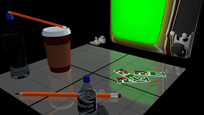
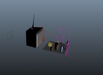
So in the meantime we decided to tackle lighting. This took many, many hours to get right.
As you can see in the above Screen Grab tutor Matt helped me out a great deal with creating artificial light. The giant arrows symbolise a large directional light. Unfortunately it had to come from below because it would give the look of a setting sun whereas if it was angled pointing down it would just look like a sunny day.
Below is this light put into action.
I felt this light was partially successful in creating a dull tone and giving the grid good lighting but I just didn't like what the background looked like on closer glance. I felt the visual aesthetic would be far more successful if the background was all black. This represents the idea that in this world there might not be anything outside of this grid as everything else is darkness which captures the tone we're trying to go for.
In the above screen grab we are definitely getting closer to the perfect look. Tutor Matt spent a great deal of time trying to help us with giving our TV a nice glow effect but unfortunately it didn't work out.
We were definitely getting somewhere at this stage but I felt the scene was missing something. The TV needed to be this ominous being that's almost like a character in the way it lights the world of the characters so Number 1 is reliant on it but also kind of weary of it.
At this stage where I felt the lighting was getting to a stage where we were basically satisfied, I decided to start placing the characters in static poses in the scene to see what the lighting looked like on them because if it didn't look right on them, the lighting wouldn't work for the animation full stop.
As you can see I staged the character like in the scene where 1 throws him off the edge of the world, this is to test if when it came to filming this scene, we would actually be able to see the character. And as you can see, we can still see the character, even when he's fallen pretty far.

Well it took many hours but I finally have the exact lighting I want for my animation. It was almost there for a lot of this process but I really wanted there to be extending shadows. The idea was that the TV's light would cast the shadows, making 1 look bigger than he really is to exaggerate his physicality. I eventually set on the Spot Light light which basically cast a spot light emitting from the TV on to the characters. The Spot light was giving the effect that I wanted with the shadows cast behind it, but it was too small and looked too obviously like a spot light, and not light being cast from the TV. Every time I tried to adjust this I could only make the whole thing bigger when in actuality I wanted to make the spot light wider so you could not obviously see the circle of light. But I got nowhere. Eventually Matt had to show me how to do this and then it looked perfect.
Lighting complete I was able to try to get a clip of animation rendered.


No comments:
Post a Comment